The Future's So Bright I Need Shades: 2020's Most In-Demand Colour Trends

Well, it's that time of year again...
It's the time of year when the leaves start dropping from the trees and the experts start dropping their predictions for what's going to be hot in colour and design for the new year to come. That's right folks...Colour of The Year season is upon us and announcements from the world of Fashion and Home Decor are coming in hot.
1) Neo Mint

Already being heralded as 2020's new "it" colour, Neo Mint is taking the fashion and decor world by storm. A bright but muted green, it promotes a natural sense of calm and is really effective in creating a refreshing and tranquil space.
Why will we love this colour? Soft and crisp with a fresh undertone, this updated pastel green reflects our need to stay connected to plant life and nature in our increasingly digital world.


2) First Light

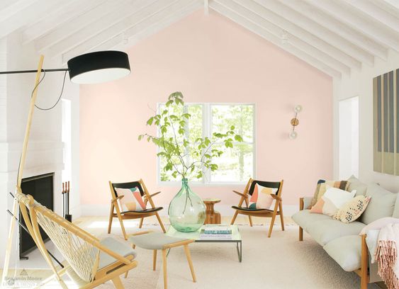
Did you think that you'd seen the last of "Millennial Pink"? Well, you'd better think again! Benjamin Moore just revealed its choice for colour of the year, naming First Light as 2020's go-to shade.
Why will we love this colour? This softer, rosy version of Blush Pink represents optimism. "First Light 2102-70 reflects a new definition of the home—a shift in mindset from the material to satisfying the core needs in life: community, comfort, security, self-expression, authenticity and ultimately, optimism.” says Andrea Magno, Benjamin Moore Director of Color Marketing and Development.


3) Mellow Yellow

All signs are pointing to yellow as being the breakout hit for 2020. It's been gracing the catwalks as a fashion colour for the last few years, but trend forecasters expect it to be adopted by the masses in 2020.
Why will we love this colour? Though previously named the official colour of Gen Z, 2020's yellow will stay cheery but it will have a much more grounded, earthy hue than it's lemony predecessor.


4) Cantaloupe

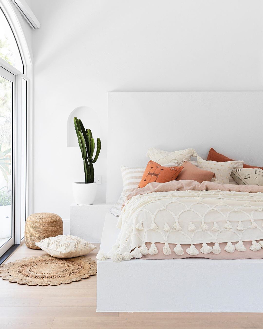
As is the trend for other colours next year, 2020's orange is a milkier, more gentle version of the bold oranges from the past. Sweet and bright with earthy undertones, this slightly feminine shade is a more youthful take on last years Terracotta trend.
Why will we love this colour? This new earth tone can be used to create environments that are soothing and warm, or fresh and summery.


5) Dusk Blue

The blues in 2020's colour palette are going to be much softer and sweeter than the saturated navies and cobalts of years past. Though still a rich shade, Dusk Blue's purple-grey undertones give it distinctive calming balance.
Why will we love this colour? This modern pastel blue has a coolness that feels fresh and contemporary.


Photography credits in order of appearance: Benjamin Moore , Liv For Interiors UK, Casa Vogue, Italian Bark, Joli Place, Benjamin Moore, Benjamin Moore, My Scandinavian Home, Salty Canary, Apartment Therapy, Who What Wear, TIME, Trend Book, Better Homes & Gardens, Domino, Visa Canada, Camilla Styles, RG Proprio, Design Inspiration, Sample Board.


Comments